CASE STUDY: Adobe Max 2025
Each year, Monotype sponsors one of the largest booths at Adobe MAX, the flagship conference from everyone’s favorite* creative software company.
MAX is one of the few opportunities we have to meet the people using our fonts and products. Our booths always include a fun activity and a memorable giveaway alongside product demos and on-site staff who can answer questions.
THIS YEAR’S BRIEF.
Monotype is primarily known for its typefaces, and in past years our MAX strategy has centered on typography and the breadth of choices we offer. This made the job easy, relatively, because fonts are inherently beautiful, creatives love them, and a typography-centric approach lends itself to almost limitless concepts.
However, our main product is a suite of SaaS tools brands can use to manage, deploy, and share their fonts throughout a team or organization. The Marketing team requested a stronger focus on font management and the solutions we offer. Typography could be the wrapper, but the core narrative had to center on these tools.
Yikes?
Our Approach.
This presented a fundamental challenge: How do we make that narrative fun?
The key to a successful event is to center on the attendee. What do they want from you? At Adobe MAX, that hierarchy goes something like this:
A fun game or activity
Cool free swag (this is #1 for some people)
Maybe a product demo or a conversation
Definitely not a sales pitch
Many brands fall into the trap of prioritizing 3 and 4 before 1 and 2, but year after year, MAX attendees tell us our booth is their favorite because it’s fun. Typography is fun on its own, but we always strive to create something memorable for people who visit our booth. Anyone who has been to a conference like this knows how mentally exhausting the sessions can be, so we try to provide a reprieve while also engaging visitors in brand- and reputation-building experience. And - no disrepect - booths that focus on SaaS tools at MAX always look a little lonely. Couldn’t be us.
So: Maintaining a sense of fun was priority number one. From that mindset, we thought about how to build a booth experience that connected through type and guided people to our tools. After all, very few people come to MAX aching for information about SaaS font management, but most of the thousands of creatives in attendance love typography, and many of them have challenges managing their font library - whether they realize it or not.
My first task was to develop the overarching narrative that connect every piece of the experience. I worked with our Creative Director and Design Lead on several concepts, but everything felt too clunky or disconnected. Finally, I asked the question that got us going down the right path: What if the booth is the experience?
If you build it ...
I’ve focusing on the booth so far, but our MAX strategy extends well beyond the 20X20 space we occupy in the Creative Park. It’s imperative that all aspects of our strategy feel connected from the attendees’ perspective, from pre-event communications to the conference itself and beyond.
To that end, I broke our narrative down into three key layers:
People love fonts - they love to play with them, learn about them, design with them, and talk about them. This would be the hook that drew people to our booth and enticed them to hang around.
Designers and brands need font management - they have to license, share and use fonts efficiently to avoid headaches. This was the core of our message: If you love fonts, it’s crucial that you know how to use and care for them.
Monotype is the only company that gives you both. Our tools and systems make it easy for you to focus on the fun part of fonts - making cool things with them
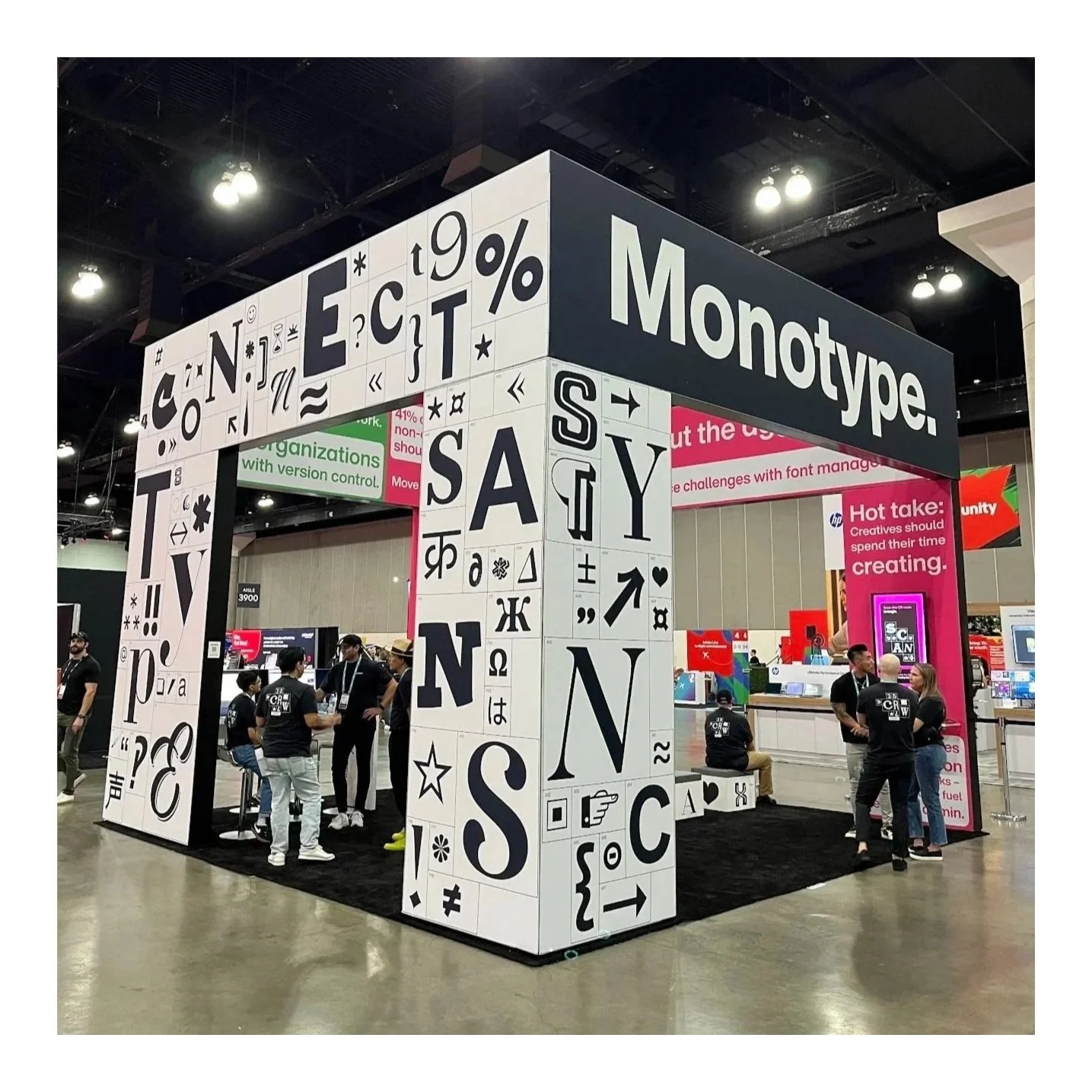
Our booth, ready to entertain the masses.
The booth mapped directly to these layers. I worked with our design team to develop an exterior wrapped in type, with hundreds of different glyphs from our library. We embedded keywords into the grid that reflected our value prop and brand positioning - subtle nods to the narrative we’d tell within.
This exterior doubled as our activation - a sort of “Where’s Waldo,” but for fonts. I wrote a short quiz that challenged people to identify fonts (multiple choice, just to make it fair), and answer subjective questions such as, “which font would you send to a job interview in your place?” The quiz was built through a survey tool and all answers were captured for later use (more on that in a bit). Participants received a water bottle with a similar design.
The quiz also gave us an opportunity to wander around and interview for our annual Adobe MAX podcast. The activity provided easy conversation starters and allowed us to meet people in the moment of engagement, which led to some really fun interviews..
Moving inside, we shifted the focus to our products with different color scheme and visual style. These interior walls highlighted statistics from our own research that illustrated the challenges teams face with font management, such as wasted time and lost creative productivity. We interspersed these with pithy taglines I created, such as “Helvetica without the hassle” and “Futura without the frustration,” which nail our value prop in the simplest possible terms.
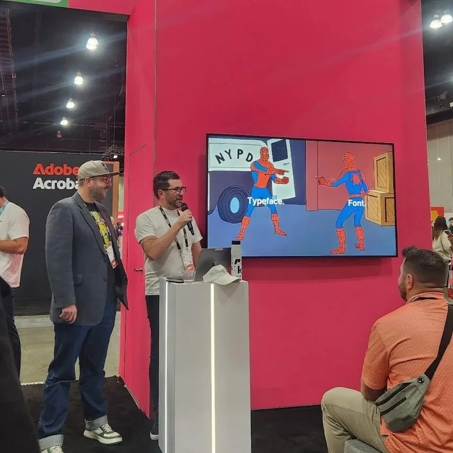
Me talking. When in doubt, put a meme in it.
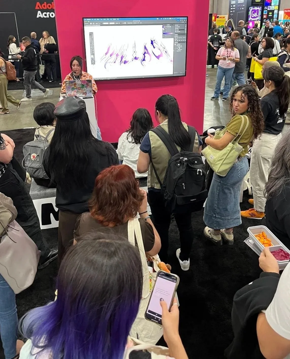
We also created space for short presentations within the booth - something we’d never done before. These included case studies of work we did for the Obama Foundation and PRIDE Amesterdam, product demos, and a font licensing overview I delivered with a member of our legal team.
Each of these talks lasted only 10-15 minutes, and I worked with each presenter to sharpen their message and accompanying visuals. We focused on niche topics that would attract a small but engaged audience looking for answers and 1:few dialogue. Each of these talks ended with a handoff to our demo area and/or Monotype subject matter experts who were on-hand for further conversation.
We deigned the presentation area to be modular, which also offered people a place to sit and rest or speak with a Monotype staffer. (Or for one of us to rest.)
While these talks were focused, our conference speaking session tied a neat bow around the whole narrative. I worked with two of our most senior creative type directors to build a 40-minute talk that touched on current trends in typography, looked ahead to forthcoming innovations in graphic design and new use cases for type, and connected back to our unique industry position and value proposition. I participated in the presentation as the “Omniscient Narrator,” whose role was to interrupt with quips, keep our speakers on track (with more scripted quips), and jump in with definitions and explanations for some of what the speakers discussed. In hindsight, I guess I was the comic relief?
My team and I also created every bit of copy for pre-event emails previewing our activities, post-event follow-ups, geo-targeted paid social, in-booth signage, daily social posts, and probably (definitely) a few things I’ve forgotten.
… They will learn about font management.
There is one metric I care about for in-person events: Are people taking pictures?
One of our speakers miraculously holding the attention of several hungry, tired, over-caffeinated (or under-caffeinated) conference attendees.
You know you’ve connected when someone whips out their phone to take a photo of a presentation slide or, in this case, your booth design. Even better when that person turns to you and says, “I need to show this to my boss.”
Suffice to say, all of that happened at MAX. People LOVED the booth and quiz. Over 1,500 people participated. The sight of attendees slowly circling our booth, pointing and laughing with their friends, created buzz and drew curious onlookers to check it out. We completed hundreds of demos inside the booth - far more than in years past and with major key accounts I cannot mention here - and both our in-booth and conference presentations were well-attended.
Immediately following the event, we collected the quiz results and published them on our website, then sent the link to everyone who visited our booth. This was planned ahead of time and allowed us to re-engage those individuals mere days after they returned home.
Lastly, we published our podcast episode a few weeks after the conference. This annual project focuses on people who visit our booth and offers unique insight into what “regular” people think about type, the creative industry, new technology, and their craft. It’s a lot of fun for us and while some people are microphone-shy, people love the opportunity to share their point—of-view with our subscribers.
The podcast is a great way to wrap up this case study review, as it also includes me and my teammates reflecting on the experience and our respective exhaustion levels. MAX is always a good challenge and a fun time, and 2026 might have been my favorite yet.
*[whispers] I’ve never sworn at a design program more than I’ve sworn at Photoshop.